
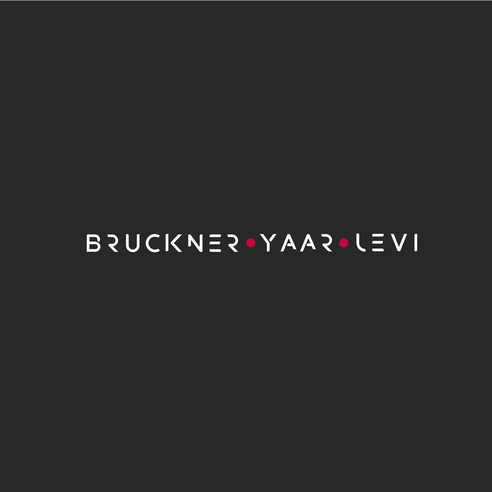
We developed the logo and visual identity for BRUCKNER • YAAR • LEVI, a powerhouse in the advertising world known for its high-impact campaigns across TV, digital, and print. The goal was to create a mark that feels modern, sharp, and highly recognizable, while maintaining a clean, versatile form suitable for consistent use across all media.
The custom-designed typography blends precision and creativity - with geometric cuts and unique angles that introduce a subtle tech-forward twist. The letterforms are stylized but legible, giving the logo a distinct character without sacrificing clarity.
The three red dots act as both dividers and design anchors, giving rhythm to the composition while hinting at collaboration and movement. The monochrome palette with a pop of deep red reinforces a feeling of confidence, boldness, and professionalism.
One of the core challenges was scale: the logo is often used in small spaces — at the end of television commercials, digital banners, or sponsorship screens. It needed to remain legible, balanced, and representative even at minimal sizes. The final design meets that challenge with a compact, impactful layout that maintains brand presence wherever it appears.
This identity captures the agency’s voice - creative, strategic, and forward-thinking - in a logo that works hard behind the scenes of Israel’s biggest campaigns.

the new logo
logo with negative background

Logo inspiration

Logo options


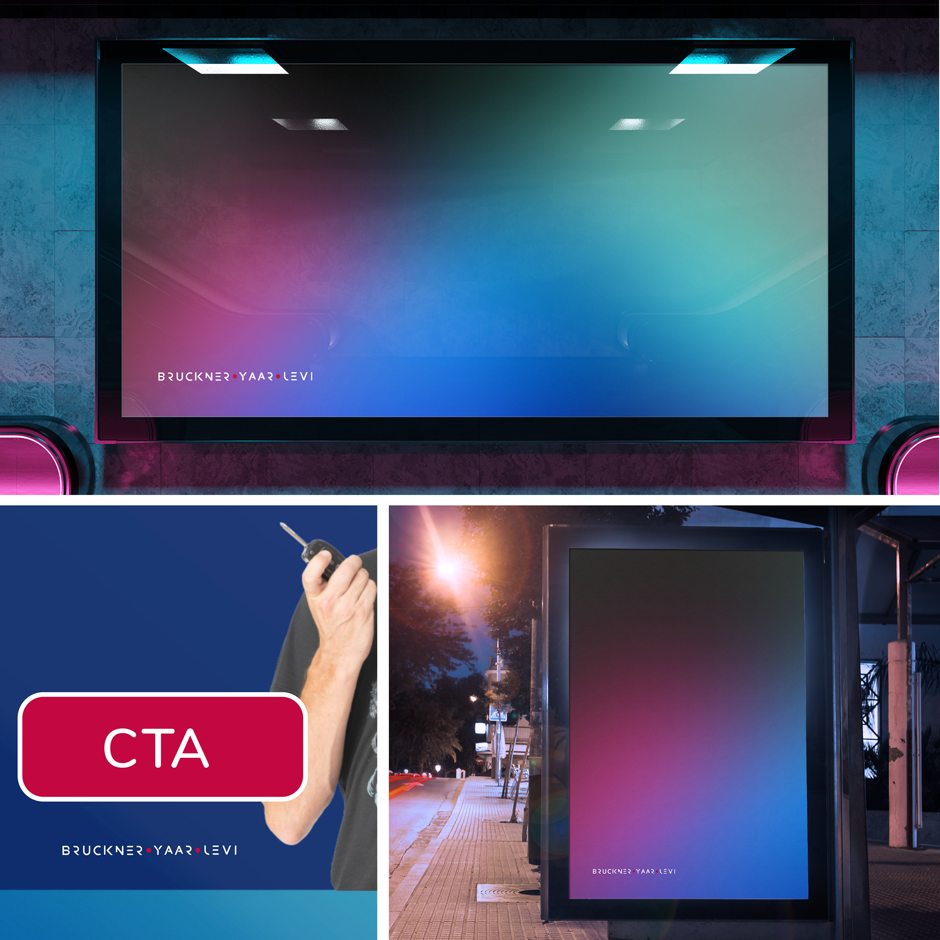
Media display

Stationary


BTL company logo

Youtube
